Messenger
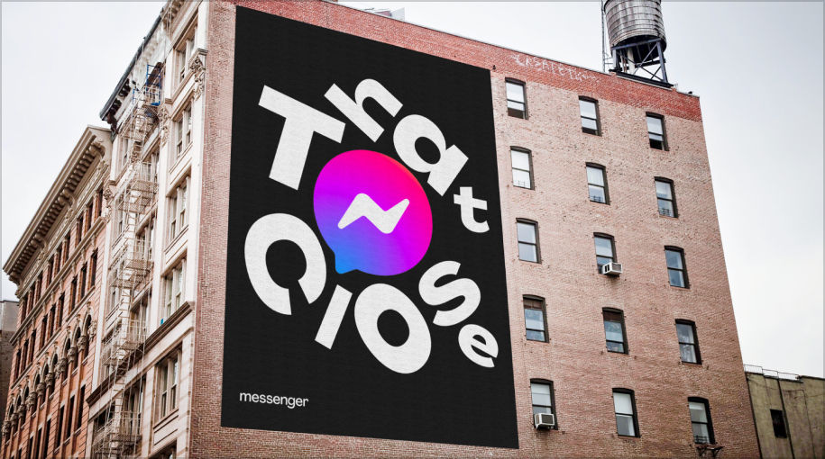
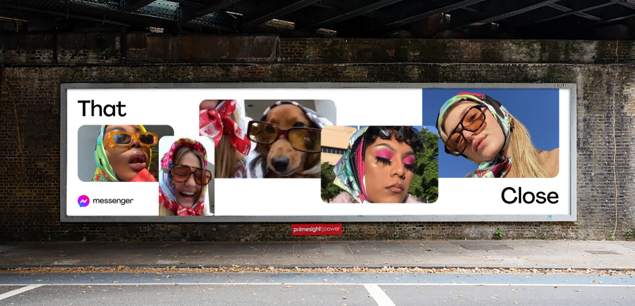
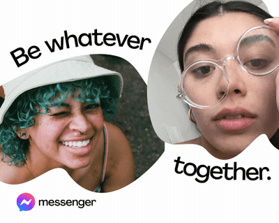
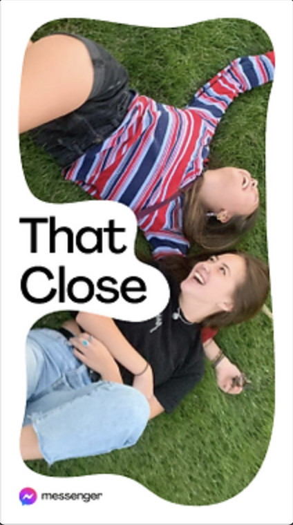
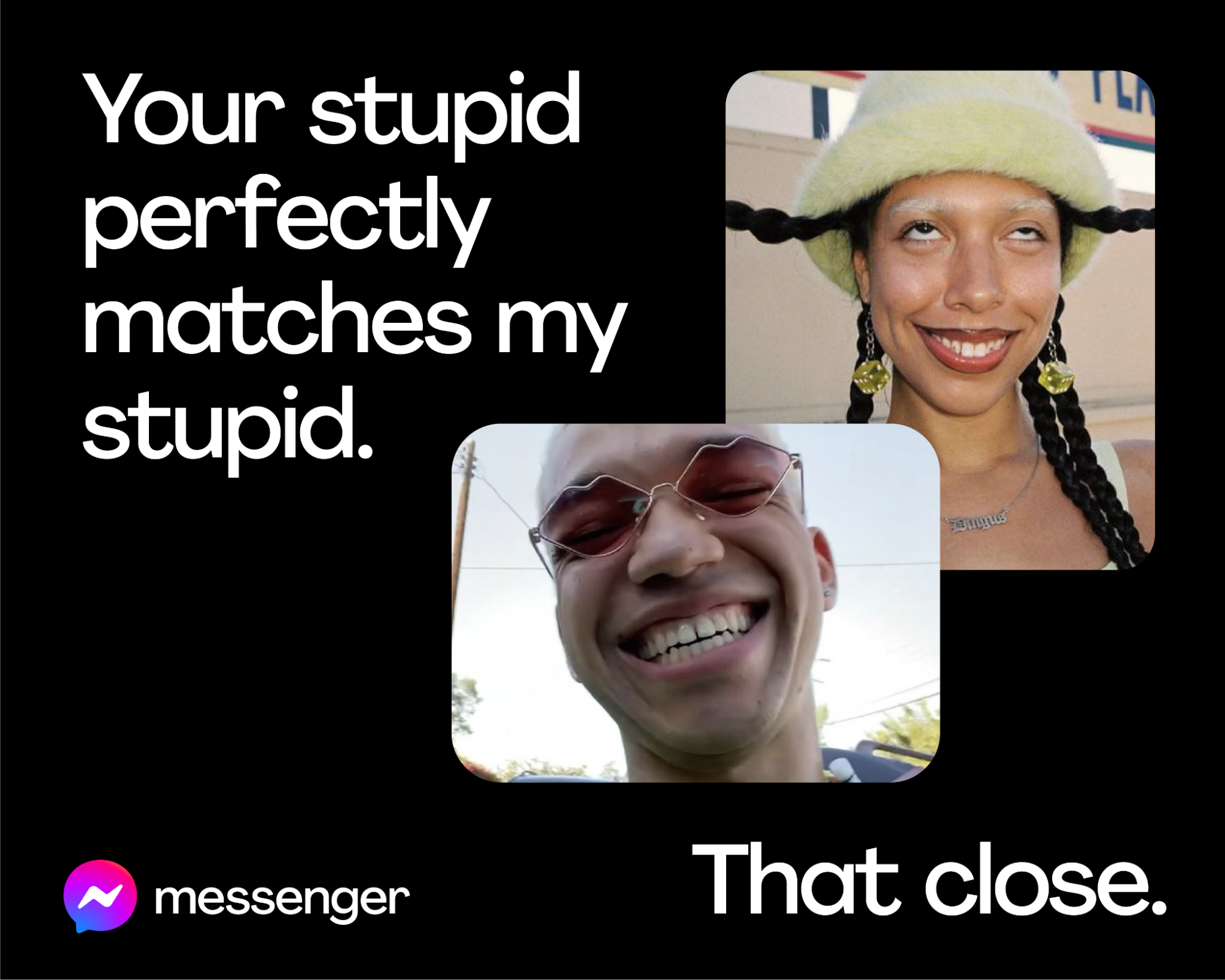
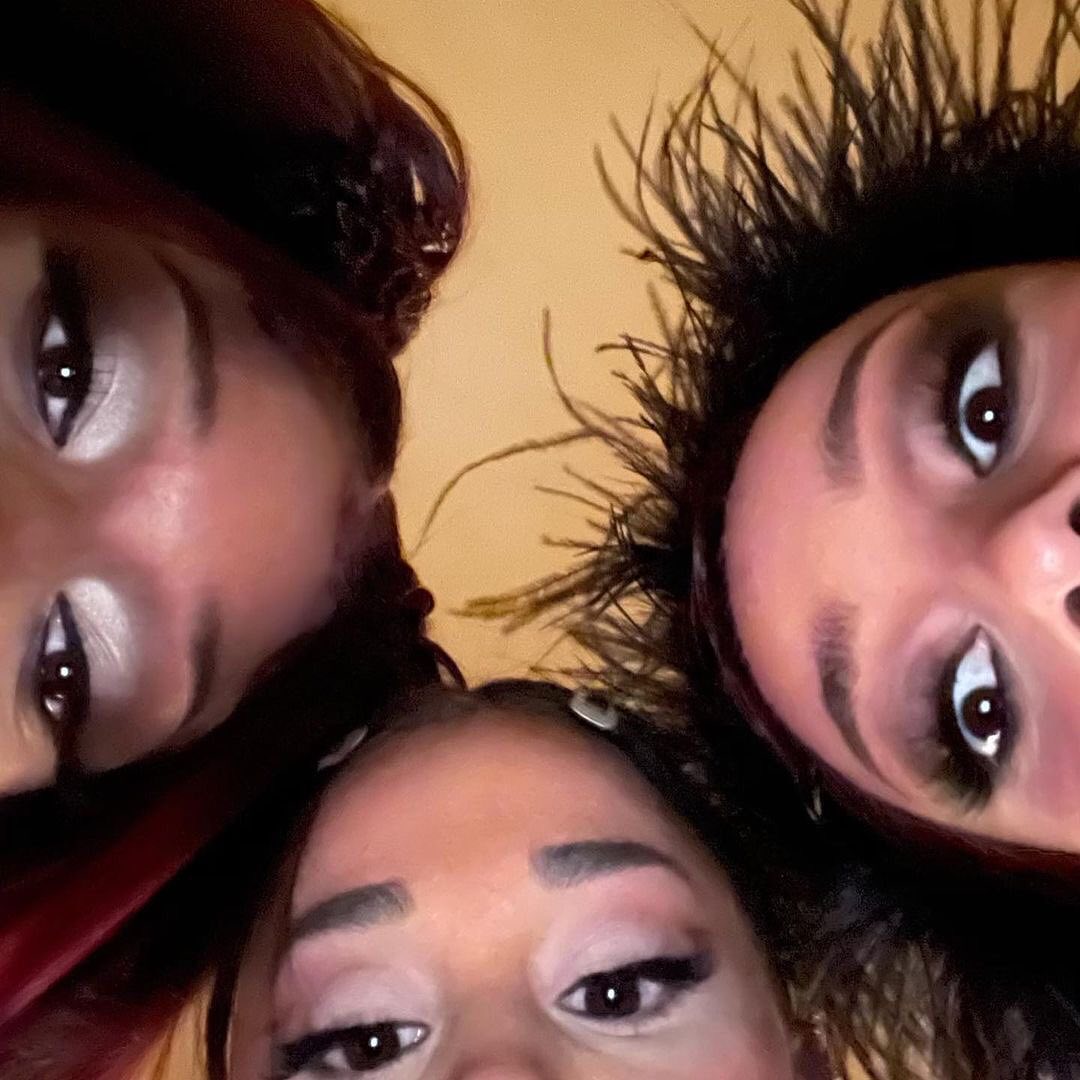
Messaging your friends is never pretty. Two inches from your nose. No makeup. Peak bathroom meme research. But that's how close we are. Not close. That close.
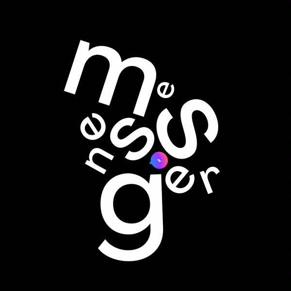
That was the pitch for Messenger's 'That Close' campaign. The goal: capture the perfectly imperfect moments where real connection happens. Built for Gen-Z, the visual identity reflected the fluid, dynamic way they actually communicate — celebrating millions of daily micro-interactions.
That was the pitch for Messenger's 'That Close' campaign. The goal: capture the perfectly imperfect moments where real connection happens. Built for Gen-Z, the visual identity reflected the fluid, dynamic way they actually communicate — celebrating millions of daily micro-interactions.
The industry picked up on the shift: Messenger as a catalyst for connection, not just messaging. Four out of five users valued connecting with family and friends more than anything else. We built a brand around that.


Agency
Facebook Creative X
Facebook Creative X
Production
Toast, Mother London
Toast, Mother London
Role
Concepting, Art Direction
Team
Sr CWs • Euzcil Castaneto & Daniel Alveraz
CD • Tom Francesconi
Concepting, Art Direction
Team
Sr CWs • Euzcil Castaneto & Daniel Alveraz
ADs • Sharon Kaye
GCD • Abdul Wahid Ovaice
Head of Creative • Andy Hekimian